Senior Content Designer, MyFitnessPal
Bringing content strategy expertise, UX writing, and testing strategy across multiple empowered teams.
UX and all the rest for the #1 nutrition tracking app with more than 80 million daily active users.
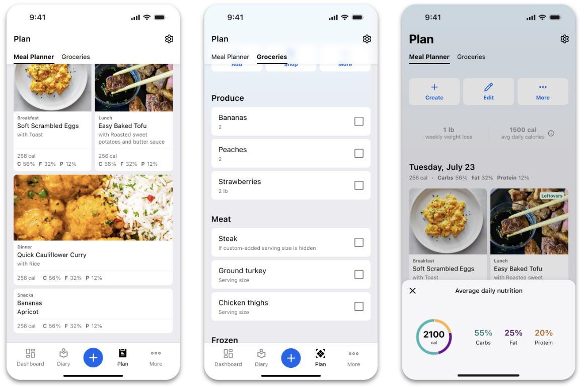
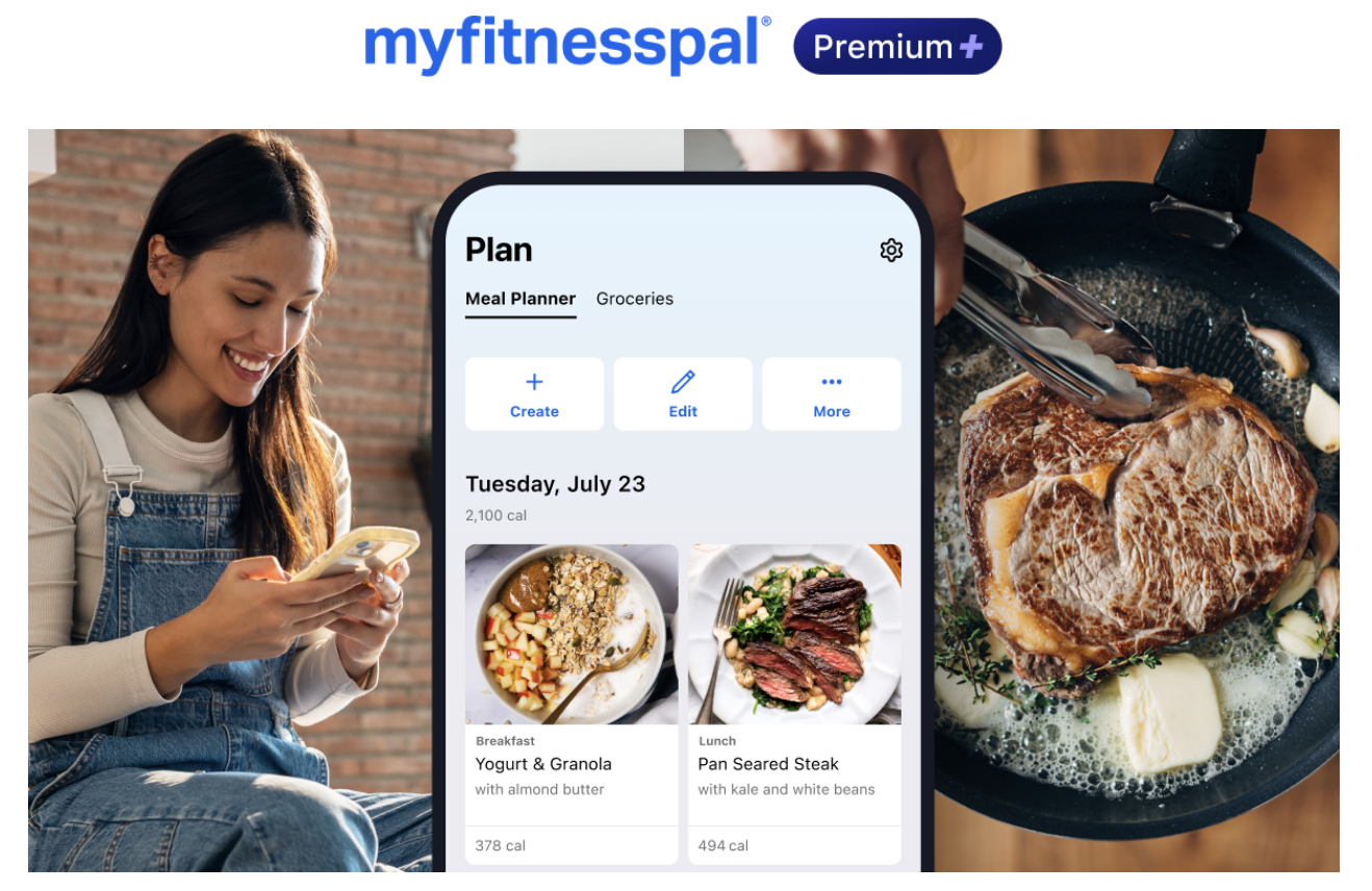
A (huge) new feature, start to finish
Lead content designer on our new Meal Planner feature. Every flow end-to-end, from upsells and trial experiences to onboarding and full integration with nutrition tracking.
The project: MyFitnessPal acquired Intent, a meal planning app, in Summer 2025. As lead content designer on the nutrition planning team, I worked hand-in-hand with product design and engineering to turn Intent into MyFitnessPal’s extensive Meal Planner feature. We launched v1 by Spring 2025.
The challenge: Rebuild and redesign one complex app inside another complex app in a way that feels seamless and effortless for the user.
-
To accomplish this, I:
Adapted the flows to our content design system and our voice and tone framework
Established and documented new content design rules to ensure consistency across the feature
Considered the entire user journey of MyFitnessPal and Intent, from onboarding to subscription renewal
Led reviews with Legal to validate product design for third-party integrations and ensure compliance early in development
Partnered with Product and Lifecycle Marketing to collaborate on a suite of Premium+ upsell experiences leading up to launch
Designed content for each of 7 distinct user journeys, from free trial experiences to Premium+ upgrades
Spent all day, every day in Figma with our lead product designer and engineers to create the experience flow by flow
-
Meal Planner 1.0 launched as part of a new price tier (Premium+) in early April 2025 in the United States, Canada, UK, Ireland, New Zealand, and Australia. In October, Meal Planner received a special mention inTIME’s Best Inventions of 2025.
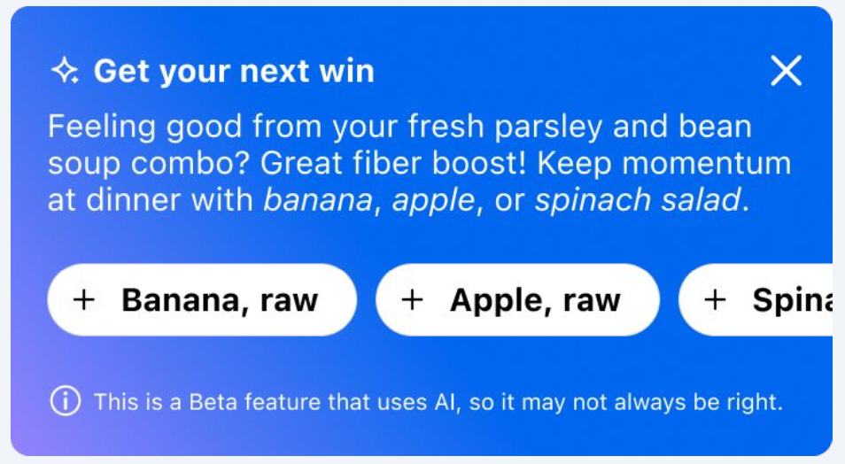
AI-generated content that scales
Lead content designer on AI experimentation. In one sprint, we laid the groundwork for the future of LLM-generated content for MyFitnessPal.
The challenge: Find a way to take MyFitnessPal from “food calculator” to “personal nutrition coach” harnessing the power of AI. We hypothesized that AI could help us give users smart, personalized feedback on their nutrition choices in real time. But could we deliver quality advice and relevant suggestions that sounded like us and not like AI?
-
Build a custom LLM that could tap into users’ logging history to offer on-the-spot insights and suggestions as content cards on their home screen. Then train that LLM on our voice, tone, and messaging guidelines.
-
As the lead content designer on the Search team, I collaborated with product management, design, and engineering. To create the content portion of our prompt, I added our content and brand voice guidelines for our LLM to reference. Then I created a 10-scenario testing framework with high-quality content examples our LLM could follow.
-
After lots of testing and tweaking the prompt (and a few arguments with Claude), we found we could generate in-app content in our brand voice consistently at scale. For us, that meant less time editing, approving, updating content in the app, and more time to focus on content strategy.
-
Not only is this possible, but it worked faster than expected. With the right framework and examples, we were able to strike a balance between controlling the output and letting AI take the wheel. We were able to show the right message to the right user at the right time—something that had previously been impossible with traditional content design and segmentation.
We used AI very intentionally to solve this specific problem, not just to spam users with an overwhelming amount of content. Our work was just an experiment, but it unlocked some exciting possibilities that are currently in development.
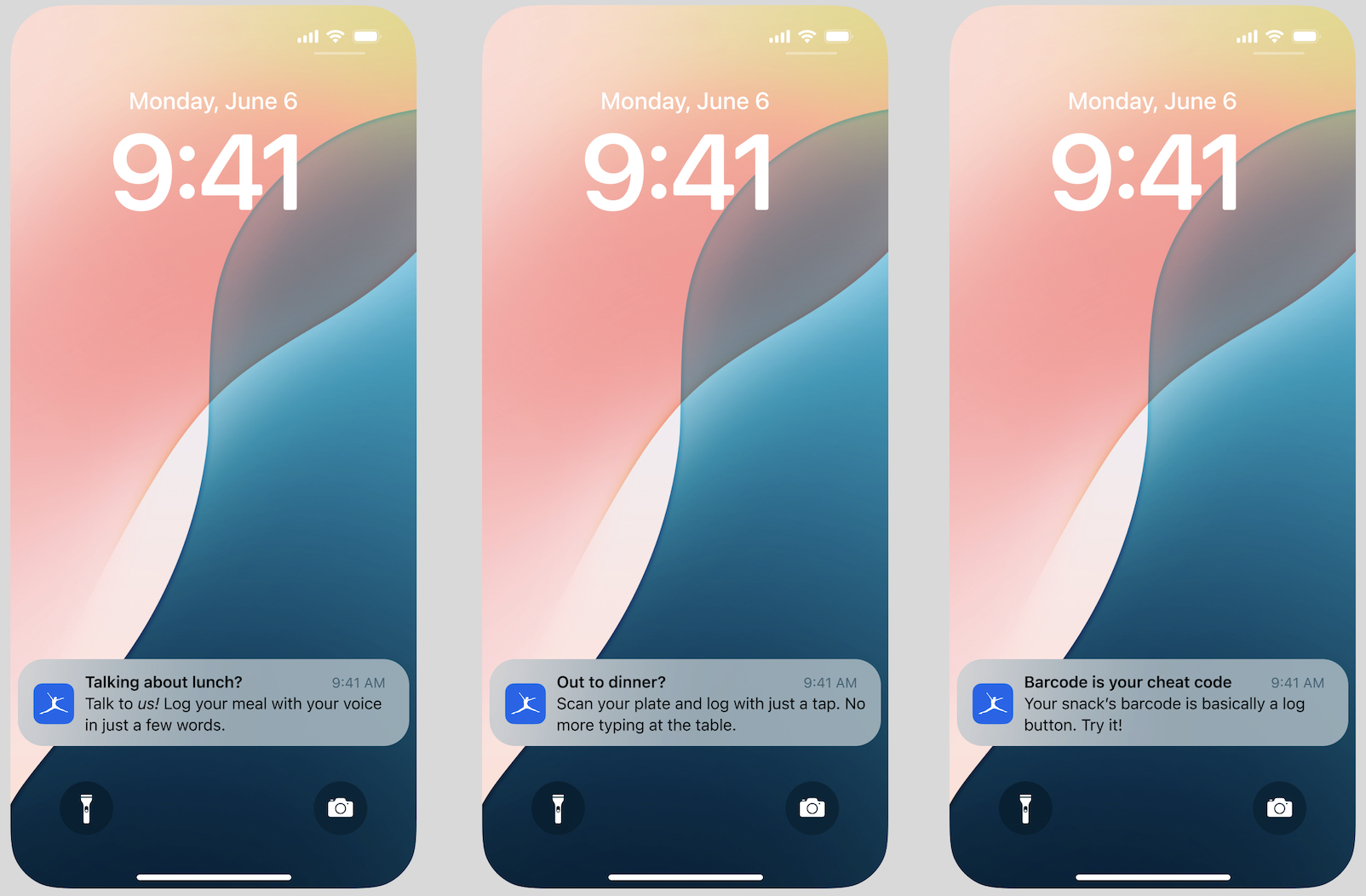
Content tests that boost engagement
Lead content designer on the Search team conducting live content tests to increase Premium tool engagement.
The challenge: We noticed users in Premium free trials weren’t consistently using their Premium tools. Even with recent improvements to our meal scan and voice log features, data showed a clear drop-off pattern: users engaged with these tools in the first few days and stopped by day five. And some never adopted the tools at all.
-
Before making time-consuming changes to these tools again, we wanted to understand if the problem was user education and awareness. We suddenly realized that beyond onboarding, we did no notable in-product user education about the Premium tools. It was very likely this was a content problem, not a feature problem.
-
We started with a low-lift content test: a set of push notifications and in-app content cards about the Premium tools. With data science, we identified critical days and times in a new user’s trial journey where we might have the biggest impact.
-
As the lead content designer on the team, I created messaging with a “What’s in it for me?” angle. Users might already understand how our meal scan tool works. But do they know it’s a great option for logging discreetly when they’re out to eat? Or that voice log actually lets them log a whole day’s worth of meals at once? We focused on the second-order benefits users can enjoy. After all, it’s about them, not us.
-
We bypassed the usual process and ran this as a rapid no-harm test, and we got a quick signal: the campaign increased Premium tool engagement for trial users by 16% in just weeks, validating our hypothesis. Users may not have known why they should use the tools at all.
-
Feature adoption depends on continuous value reinforcement. Instead of jumping to update the tools, we guided user behavior with a simple content test and made a significant impact quickly.
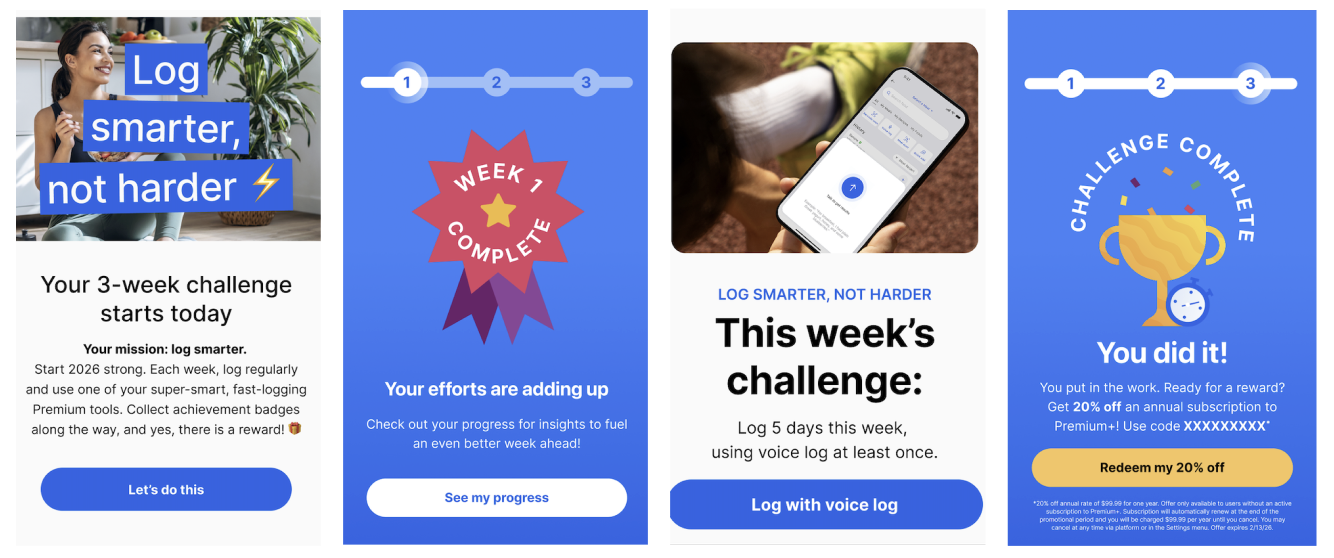
Healthy resolutions, gamified
Lead content designer and UX strategist on our 2026 New Year’s challenge Premium users.
The challenge: The Lifecycle Marketing team planned a New Year challenge campaign consisting of emails, in-app messages, and push notifications culminating in a reward at the end, but it felt disjointed. The team wanted their seasonal campaign to feel more like a cohesive product experience that could sustain motivation and engagement over time. They realized they needed help from product to make it happen.
-
Marketing’s first version of the campaign was rather transactional: get users excited about winning the prize, which was a discount on their Premium membership. While that’s very important, some of the story was getting lost. We were challenging users to log food daily not just to get the discount, but also to get in the habit of logging. Ideally, this will make them more engaged users, and more likely to convert in the long run.
-
As lead content designer on the project, I stepped in to offer a UX POV. I partnered closely with Lifecycle Marketing to give their three-week challenge a clearer progression. I helped reshape the narrative across channels with a strong through-line. I asked critical experience questions: What happens if users fail to complete the challenge? How do we build motivation and momentum week after week? How can we visualize and gamify progress instead of relying on standard reminders?
-
We evolved the campaign from a traditional marketing push into a product-led engagement experience. We fused lifecycle messaging with in-product behavior to help keep users engaged. Not only did we want them to be excited about the prize, we wanted them to be proud of their progress and get in the habit of logging, too.
-
When campaigns live inside the product, content design helps create continuity and momentum. Applying UX thinking to lifecycle messaging turns reminders into experiences that actively support ongoing behavior change.
Testing, testing
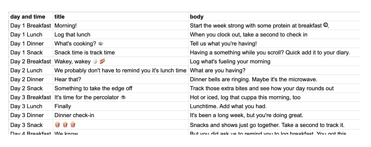
Lead content designer on our meal reminder content audit, messaging refresh, and new testing strategy.
The challenge: Our meal reminders were stale, and they didn’t match our brand personality at all. So stale, in fact, that most people at the company didn’t have them turned on. Meal reminders were an afterthought for a long time. But even so, users who had signed up for these reminders actually engaged with them. We hypothesized that if we actually make these reminders just plain better (targeted, entertaining, NOT monotonous), we could boost engagement in a meaningful way.
-
We collaborated with our Lifecycle Marketing team to test our way into what worked best. We turned Meal Reminders into its own mini product team. This meant a rigorous A/B test schedule, building on successes, and cutting messages that didn’t perform well.
-
Starting from scratch, we saw a huge opportunity to target customer segments with relevant messages for their user journey and habits. We also mixed regular reminders with moments of surprise and delight to reinforce our brand voice. Selfishly, I had a lot of fun writing dozens of punchy messages in our voice, testing new angles, and taking our tired messages in a very different direction. We had a blank check to test the content we wanted as long as we kept the user tests to small groups.
-
Our first small test, which ran just one week’s worth of new messaging, showed a 3% increase in engagement. And that was just the beginning. As a content designer, there are few experiences as satisfying as getting to lead a content-first strategy from the ground up and hearing the words “Have fun with it.”
Voice + tone documentation
Lead content designer on brand voice and tone workshops across product and marketing.
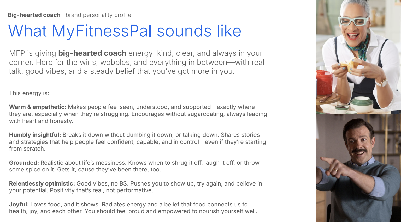
The challenge: We really needed unified brand voice and tone documentation for marketing and product. With the silos that naturally happen in organizations, this was long overdue. Our marketing and product voice and tone were similar, but we needed them to be indistinguishable and as seamless as possible. But as always, voice and tone are slippery. The harder you try to pin it down, the harder it is to grasp.
-
The company was changing rapidly, and we didn’t want it to lose its soul. Working with creative leadership, I organized regular cross-functional Figjam workshops with our product and marketing writers to create concrete voice and tone guidelines. As a council of word nerds, we put our heads together to debate the big questions: who are we, what is this place, and where are we going?
-
We used the output of our workshops to create a series of high-level personas that tell the story of who we are on our best (and worst) days, whether in emails or in the app. MyFitnessPal is a beloved legacy product, and it’s always had a voice, or at least echoes of a voice, mostly shared through organizational folk knowledge. By giving this voice a name and adding aspirational guidelines in an organized framework, we started to bring the brand to life and define what makes us unmistakably us.
-
It’s easy for marketing and product to stay in their own lanes long enough that voice and tone can evolve differently in parallel. Proactive cross-functional collaboration and documentation can help us all speak the same language and give the brand a stronger point of view.
It’s not that nobody wanted to do this documentation work. Everybody was understandably too busy. But when we prioritized this work and made the time, great things happened that benefitted us all in the long run.